Crescent Creek
Crescent Creek is a small-town financial institution that offers a range of banking services, including savings accounts, checking accounts, loans, mortgages, and other financial products.

Project Overview
Crescent Creek Credit Union is trying to improve the user experience of its website, focusing on key areas such as simplifying the transaction process and ensuring transaction security.
Empathize

Interviews users to collect insights for forming the creation of empathy maps, user personas, user stories, and journey maps to better understand and address user needs.
Define & Ideate

Analyze data, formulate hypothesis and goal statement, perform competitive audit and create wireframes to explore design solutions.
Prototype & Test

Develop low-fidelity and high-fidelity prototypes to visualize the app’s structure and functionality and perform usability test to collect user insights.
Empathize
User Interviews
User interviews for Crescent Creek Credit Union targeted adults aged 18-55 to understand their banking needs and preferences. The interviews aimed to gather insights on how users currently interact with banking websites, their pain points, and their desired features. The interviews helped uncover key issues such as the need for improved transfer tracking, simplified processes, and enhanced transaction security.
Research goals that were used to guide the interview process were:
What are the user’s pain points with banking transfers when it comes to online banking?
What are the user’s desire’s when it comes to online banking?
How can efficient online bank transfers benefit busy adults?
Interview questions that were asked during this phase:
How do you take care of your banking with a busy schedule?
Why do you like or dislike online banking?
How many times a month do you use online banking?
What are some things you would like to see when it comes to balance transfers in online banking?

Empathy Maps
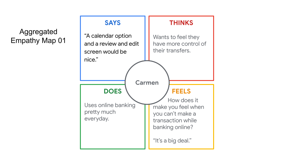
For Crescent Creek Credit Union, four one-user empathy maps were created based on individual user interviews, highlighting the users thoughts, feelings, actions, and what they said. These individual maps were then aggregated to create two larger empathy maps that synthesized common themes and pain points across multiple users. The aggregated maps highlighted common themes such as the desire for improved transfer tracking, simplified processes, and enhanced transaction security. The empathy maps helped visualize user experiences and provided insights into the needs and preferences of the target audience.
User Personas
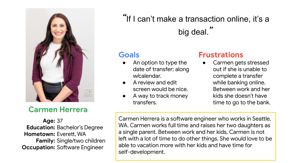
User personas for Crescent Creek Credit Union were created to represent key user segments based on the insights gathered from user interviews and empathy maps. One of the personas, Carmen Herrera, represents a single mother and software engineer from Everett, WA. Carmen is a busy professional who juggles work and home life and doesn't have time to physically visit the bank. She gets stressed if she's unable to complete a transfer, highlighting the importance of a seamless and efficient online banking experience for her.
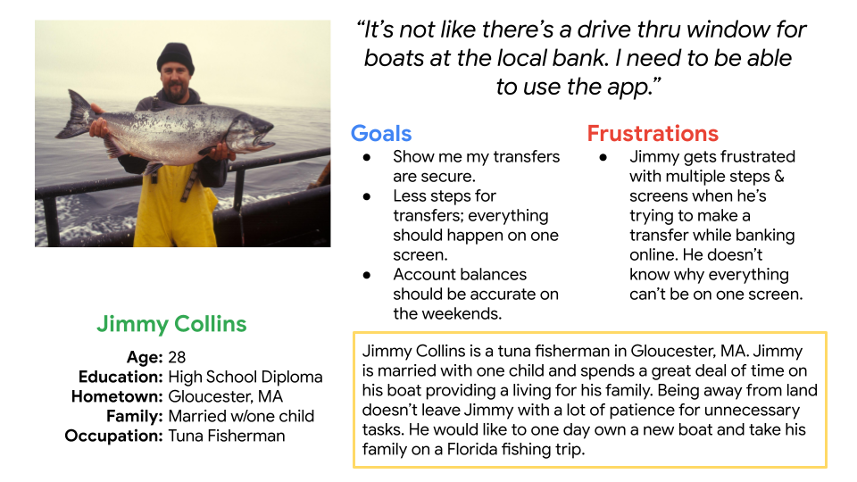
Another persona, Jimmy Collins, represents a 28-year-old married fisherman from Gloucester, MA. Jimmy values security and would like to see that his transfers are secure, indicating a need for Crescent Creek Credit Union to prioritize trust and security features in their online banking platform.
User Stories
For Crescent Creek Credit Union, two user stories were created to illustrate specific scenarios and challenges faced by users. One user story focused on Carmen Herrera, a single mother and software engineer who needs to transfer money quickly and securely without having to visit a bank branch. The other user story centered around Jimmy Collins, a 28-year-old married fisherman who values security and wants to ensure that his online transfers are safe and reliable. These user stories helped to humanize the design process and prioritize features that address real user needs.
User Story Carmen: “As a busy professional and single parent I want to be able to handle all my banking transfers online, so that I can get back to work and spend time with my daughters.”
User Story Jimmy: “As a tuna fisherman and family man I want to take care of all my finances online, so that I can get back to taking care of my family”
User Journey Map
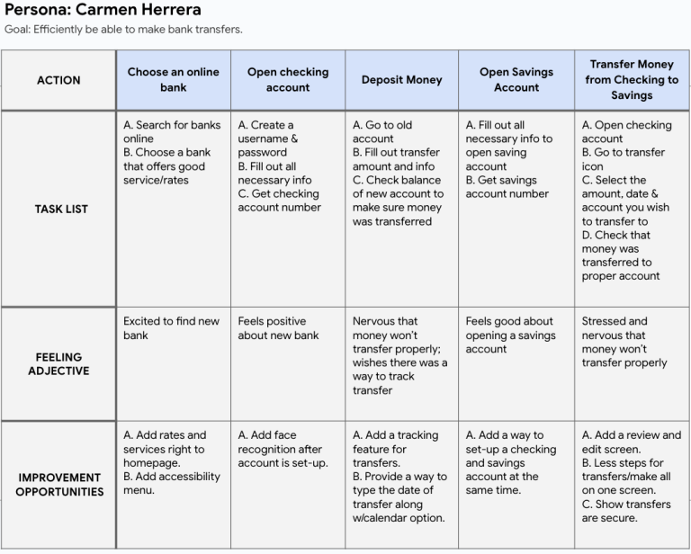
The user journey map for Crescent Creek Credit Union illustrated the key touch points and emotions experienced by users as they interacted with the banking website. It detailed Carmen Herrera's journey as a busy professional and single mother, highlighting her frustrations and needs during the banking process. Another map also depicted Jimmy Collins' journey as a security-conscious user, emphasizing his desire for a secure and reliable banking experience. The user journey maps helped identify opportunities to improve the user experience and inform the design of the website.
What Was Learned
During the empathize phase of the Crescent Creek Credit Union project, several key insights were gathered through user interviews, empathy maps, user personas, user stories, and user journey maps. These insights included the need for improved transfer tracking, simplified processes, and enhanced transaction security. The empathize phase provided a deep understanding of the needs and preferences of the target audience, guiding the design of the website to better meet user needs.
Define & Ideate
Problem Statement
The problem statement for Crescent Creek Credit Union focuses on Carmen's need for an online banking solution that provides efficiency and security.
Carmen is a busy professional and single mom who needs an online bank that offers efficient and secure transfers because she doesn’t want to worry if her finances are safe.
This problem statement highlights the importance of security and efficiency in online banking for users like Carmen.
Competitive Audit
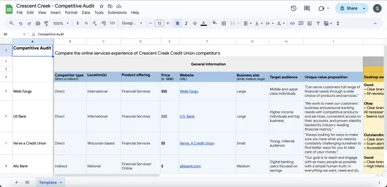
The competitive audit for Crescent Creek Credit Union included an analysis of competitors such as Wells Fargo, US Bank, Verve Credit Union, and Ally Bank. The audit revealed that some competitors had visually appealing websites but lacked an accessibility menu, which could be a drawback for users with disabilities. However, others had scam alert notices on the front page, indicating a proactive approach to security, which could be a positive feature to consider. Some competitors had a cluttered layout, suggesting that a clean and organized design could be a competitive advantage for Crescent Creek Credit Union.
Click the button below to view full image.
How Might We Statement
The "how might we" statement for Crescent Creek Credit Union focused on improving the efficiency and security of transfers on their website. It aimed to address the need for a seamless and secure transfer process for users like Carmen, who value convenience and peace of mind when managing their finances online. This statement guided the ideation phase, encouraging brainstorming innovative solutions to enhance the transfer experience for users.
How might we make the Crescent Creek Credit Union website efficient and secure when it comes to transfers.
Rapid Sketches
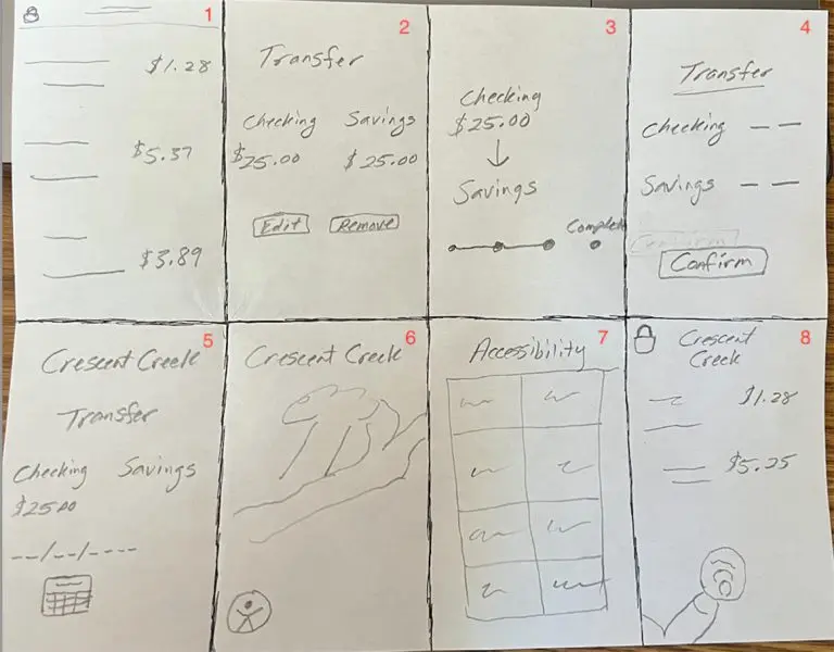
Rapid sketches were created for Crescent Creek Credit Union to quickly explore and visualize design ideas. These sketches helped generate diverse concepts for improving the efficiency and security of transfers on the website. They served as a starting point for ideation and allowed for quick iteration and refinement of design concepts based on feedback and insights gathered from stakeholders.
What Was Learned
During the Define and Ideate phases of Crescent Creek Credit Union, several key insights were learned. The problem statement highlighted the need to improve the efficiency and security of transfers on the website. The competitive audit revealed strengths and weaknesses of competitors' websites, such as visually appealing designs but lacking accessibility features. The "how might we" statement focused on making transfers on the website more efficient and secure, guiding the ideation phase to brainstorm innovative solutions. Rapid sketches helped visualize these ideas, leading to the generation of diverse design concepts for further exploration and refinement.
Low-Fidelity Prototype Phase
Flow Chart
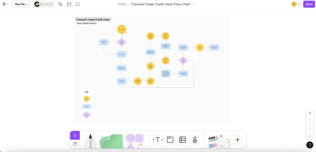
Creating the flow chart for depositing a check on the Crescent Creek Credit Union website involved mapping out the step-by-step process for users. The flow chart illustrated each stage of the check deposit process, from logging into the account to completing the deposit. It included key actions such as entering deposit details, uploading check images, and confirming the transaction. The flow chart aimed to enhance the deposit process and ensure that users could easily and efficiently deposit checks online.
Sitemap
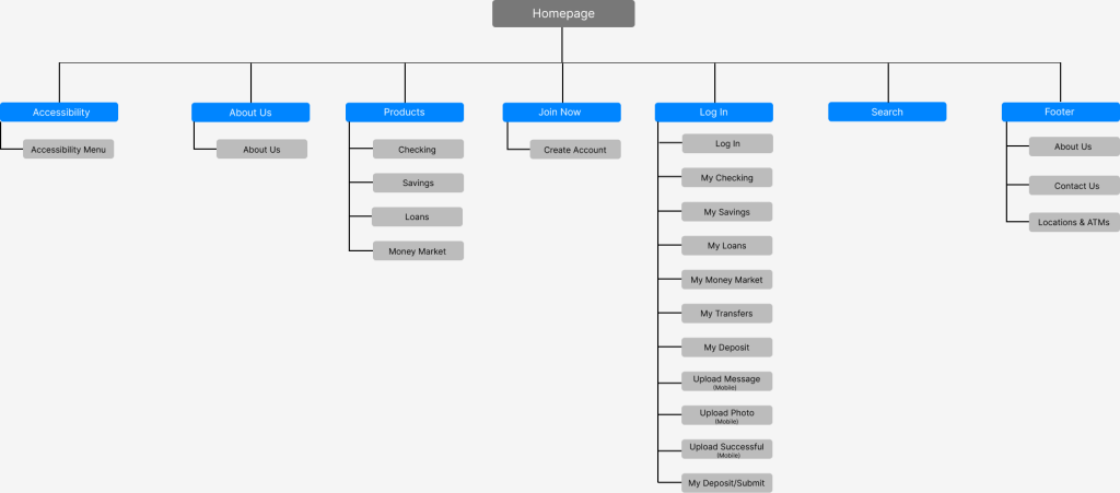
The sitemap for Crescent Creek Credit Union documented the structure of the website, starting with the homepage as the main hub. From the homepage, branches led to key sections such as accessibility, about us, products, join now, log in, search, and footer. Each of these sections was interconnected, with the homepage serving as the central point from which users could navigate to different areas of the website. This hierarchical structure helped organize the content and improve the overall user experience by providing a clear and intuitive navigation path.
Paper Wireframes
The paper wireframes for Crescent Creek Credit Union provided a visual representation of key pages, including the home, about us, log in, my account, and join now pages. The home page wireframe outlined the layout and content elements, such as navigation menus, featured products, and calls to action. The about us wireframe focused on highlighting the credit union's mission, values, and history. The log in and my account wireframes detailed the user authentication process and account management features, respectively. The join now wireframe illustrated the steps for users to become members of the credit union. These paper wireframes served as a foundation for the digital design process, allowing for quick iteration and feedback before moving to high-fidelity prototypes.
Click on image to enlarge
Lo-Fi Digital Wireframes
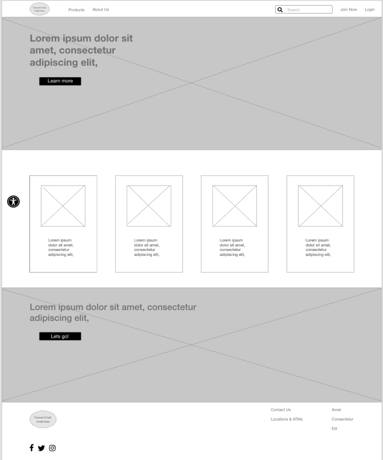
The low-fidelity digital wireframes for Crescent Creek Credit Union were created using Adobe XD and focused on key pages such as the home, deposit, loans, products, and mobile home version. The home page wireframe included elements such as a navigation bar, featured products, and a login option. The deposit and loans/account wireframes outlined the process for users to make deposits or examine their current loans. The products wireframe showcased the different banking products and services offered by the credit union. The mobile home version wireframe adapted the home page layout for mobile devices, ensuring a responsive design that is optimized for smaller screens. These wireframes provided a basic visual representation of the website's structure and functionality, allowing for further refinement based on user feedback and testing.
Home Screen – Desktop & Mobile

Lo-Fi Prototype
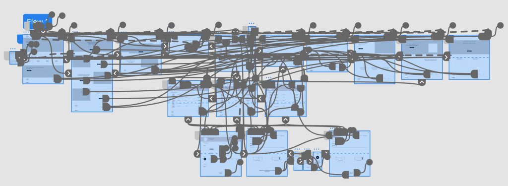
Creating low-fidelity prototypes for the Crescent Creek Credit Union website involved translating the wireframes into interactive, clickable designs. These prototypes focused on the key user flows and functionalities, such as the deposit process, banking transfers, and product browsing. The prototypes were basic in design, using placeholders for images and text to convey the overall layout and structure of the website. They were used to test the user experience and gather feedback for further iteration and improvement.
What Was Learned
Through the low-fidelity prototype phase of Crescent Creek Credit Union, several key insights were gained. The process of creating the prototypes helped to refine the design concepts and layout of the website. It allowed for visualization of the user flow and helped identify potential issues or improvements early in the design process. The prototypes also helped to streamline the development process by providing a clear direction for the final design. Overall, the low-fidelity prototypes served as a valuable tool for iterating on design ideas and shaping the final website design.
Test Phase
Usability Study
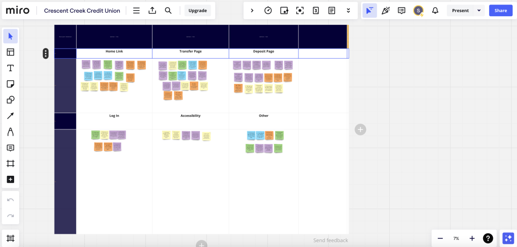
The usability study for Crescent Creek Credit Union involved testing the low-fidelity prototypes with users to gather feedback on the design and functionality of the website. The study aimed to identify any usability issues and gather insights to inform further improvements. Participants were asked to complete tasks related to transferring money, depositing a check, and exploring banking products. Their interactions with the prototypes were observed and recorded, and they were also asked to provide feedback on their experience. Affinity diagrams were used to organize and analyze the data collected from the usability study. Insights from the study revealed patterns in user behavior and preferences, such as the need for clearer instructions on check deposits and the importance of security features. These insights were prioritized based on their impact on the user experience, guiding decisions to improve the website. Patterns and common themes were recognized and used to inform the design changes, ensuring that the final website design addressed the most critical user needs.
Affinity Diagram
High-Fidelity Prototype Phase
Sticker Sheet
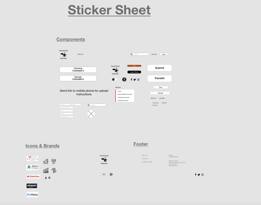
The sticker sheet for Crescent Creek Credit Union was created using Adobe XD and included components, icons, and logos that were developed for the project. The components included reusable design elements such as navigation bars, buttons, and input fields, which helped maintain consistency and efficiency in the design process. Icons were also developed to represent various actions and functions, such as depositing a check or viewing account details. Buttons were designed with different styles and states to indicate interactivity and feedback to users. Overall, the sticker sheet provided a library of design elements that could be easily used and customized throughout the design of the website.
Mockups
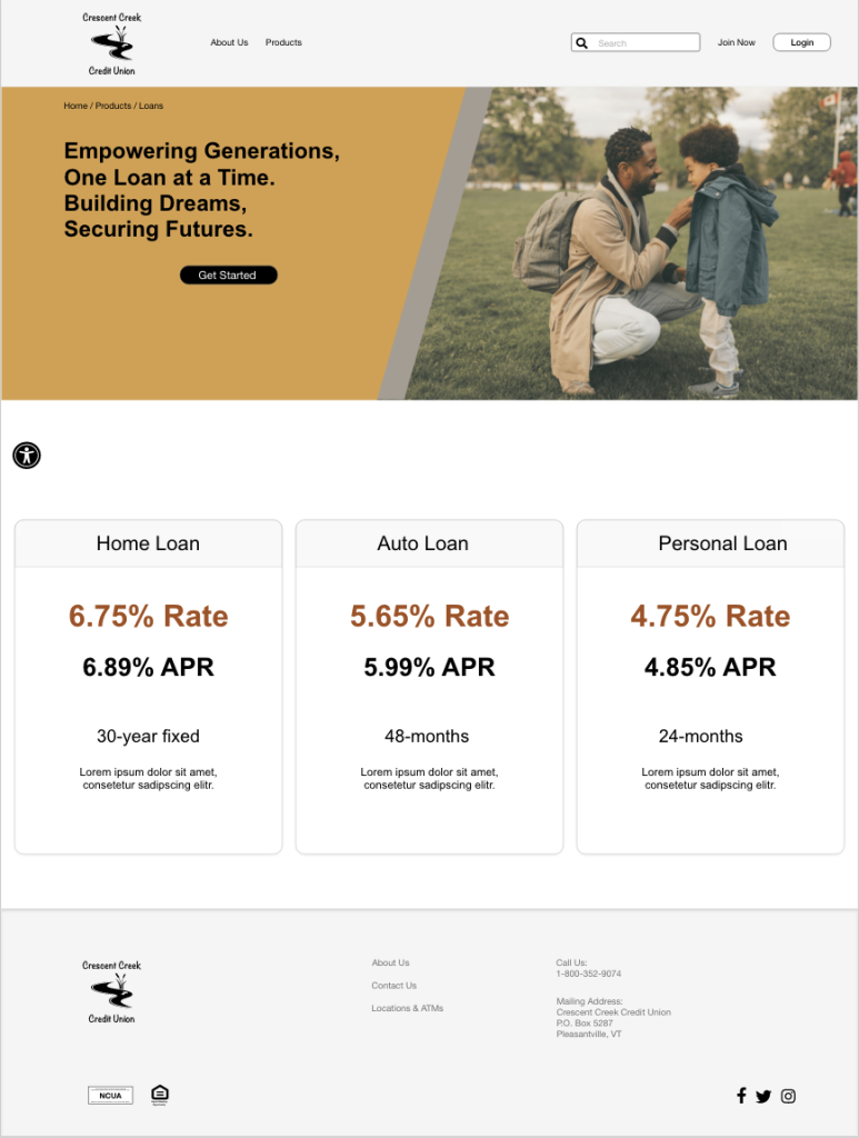
The mockups for the Crescent Creek Credit Union website were created using Adobe XD to visualize the final design of key pages. These mockups included the home page, deposit page, about us page, products page, and a mobile version of the home page. The mockups featured finalized design elements such as colors, typography, and imagery, providing a realistic representation of how the website would look and function. They were used to communicate the design concepts to stakeholders and gather feedback before moving on to high-fidelity prototypes.
Home Screen – Desktop & Mobile


Loans Product Screen – Desktop & Mobile

Hi-Fi Prototype
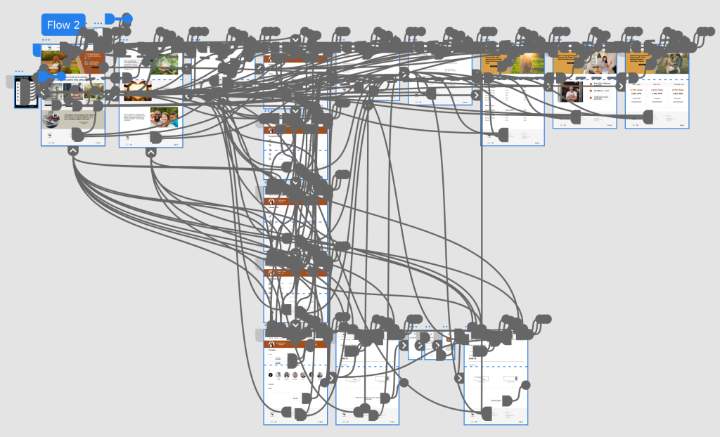
The high-fidelity prototypes for the Crescent Creek Credit Union website were created based on the feedback and insights gathered from the usability study. The study revealed the need for clearer instructions on check deposits and the importance of security features. These findings were implemented into the design of the high-fidelity prototypes, which included refined visuals, interactive elements, and detailed user flows. The prototypes were tested with users to validate the design changes and ensure that the final website design addressed the usability issues identified in the study.
What Was Learned
During the development of the high-fidelity prototype phase of Crescent Creek Credit Union, several key learnings emerged. The usability study highlighted the importance of clear instructions on check deposits and the need for robust security features. These insights were incorporated into the design of the high-fidelity prototypes, which also emphasized a clean and intuitive user interface. Additionally, the prototypes demonstrated the importance of responsive design, ensuring that the website was accessible and functional across different devices. The high-fidelity prototype phase provided valuable insights into improving the user experience and informed the final design of the Crescent Creek Credit Union website.
Key Takeaways
Building the Crescent Creek Credit Union website yielded several key takeaways. Firstly, user-centered design is crucial, as understanding the needs and preferences of the target audience is essential for creating a successful website. Secondly, iterative design and testing are important, as they allow for continuous improvement based on user feedback. Thirdly, collaboration and communication with stakeholders are essential for aligning design decisions with business goals. Lastly, incorporating security features and clear instructions can greatly enhance the user experience and build trust with users. Overall, these takeaways emphasize the importance of a holistic approach to website design that prioritizes user needs and business objectives.
Reflection
From this project, I learned the value of a comprehensive UX design process. User interviews provided deep insights into user needs, which were visualized through empathy maps and translated into user personas. The problem statement and competitive audit helped focus on key issues and opportunities. Developing a flow chart and sitemap clarified the website structure, while paper and low-fidelity wireframes allowed for quick iteration. Usability testing of low-fidelity prototypes revealed crucial insights, informing refinements in high-fidelity prototypes. This project underscored the importance of empathy, iteration, and user feedback in creating a successful user experience.
Ready to bring your ideas to life? I'm here to help
Similar projects


