Perez Health is a medical healthcare system. Perez Health provides comprehensive healthcare services, including primary care, specialty care, and advanced medical treatments, serving patients in the region and beyond.
Project Overview
Perez Health is aiming to solve a cumbersome and overwhelming check-in process for online doctor visits. Users have expressed dissatisfaction with the current experience, citing issues such as too much information, complexity, and redundancy in the check-in procedure. Perez Health seeks to streamline this process, making it simpler, more direct, and less overwhelming for users, ultimately improving their overall satisfaction and experience.
Empathize

Interviews users to collect insights for forming the creation of empathy maps, user personas, user stories, and journey maps to better understand and address user needs.
Define & Ideate

Analyze data, formulate hypothesis and goal statement, perform competitive audit and create wireframes to explore design solutions.
Prototype & Test
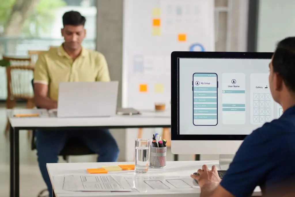
Develop low-fidelity and high-fidelity prototypes to visualize the app’s structure and functionality and perform usability test to collect user insights.
Empathize
User Interviews
The user interviews for Perez Health focused on busy adults aged 18-55 living in suburban or metropolitan areas. The interviews aimed to understand their experiences and pain points with the current e-Check-In process. Key findings included frustrations with information overload, a lack of simplicity, and dissatisfaction with online check-ins followed by in-person visits.
Research goals that were used to guide the interview process were:
What are common pain points users experience with e-Check-In in regards to doctor visits?
What are the needs of the users who use e-Check-In?
What are the processes and emotions the user is experiencing while using e-Check-In?
Interview questions that were asked during this phase:
How often do you use e-Check-In for doctor visits?
What do you enjoy about e-Check-In?
What challenges do you face when using e-Check-In?
Do you have any thoughts on how to improve the process of e-Check-In, what kinds of features would you like to see?

Empathy Maps
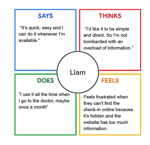
For Perez Health, empathy maps were a crucial tool in visualizing and understanding user needs and experiences. Five one-user empathy maps were created based on insights gathered from user interviews. These maps helped identify common themes and pain points among users, such as frustration with repetitive questions and a desire for a simpler check-in process. Two aggregated empathy maps were also created to consolidate these individual insights, providing a holistic view of the user experience. These maps served as a foundation for developing user personas, user stories, and ultimately, guiding the design of the e-Check-In app to better meet user needs.
User Personas
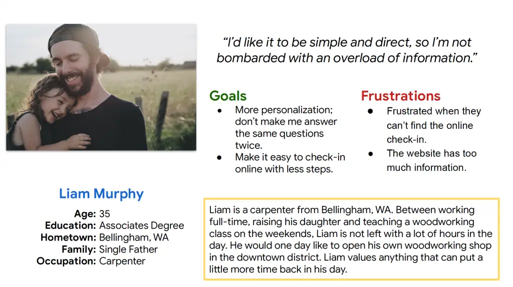
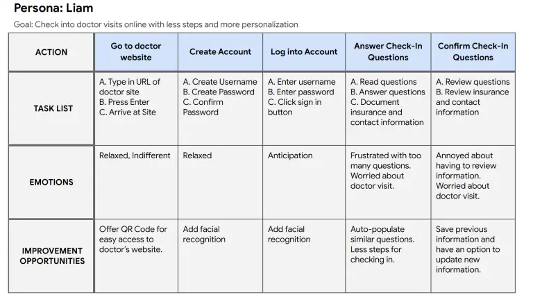
Creating user personas for Perez Health, such as Liam Murphy, a 35-year-old single father from Bellingham, WA, provided valuable insights into the specific needs and frustrations of the app's users. Liam's persona highlighted his frustration with the e-Check-In section's visibility and his desire for more personalization and reduced redundancy in the check-in process. This persona was created based on data from user interviews and empathy maps, helping to humanize the target user group and guide design decisions to better meet their needs.
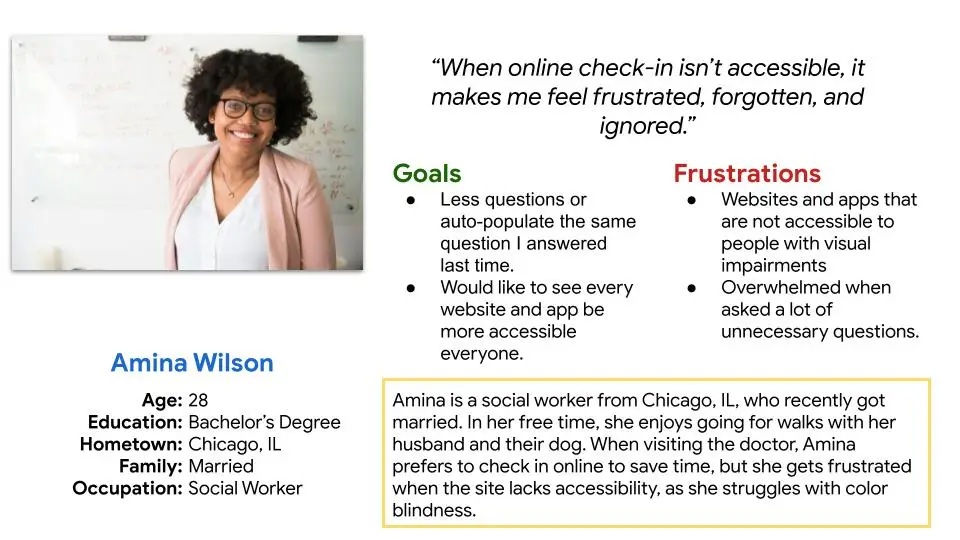
The second user persona for Perez Health is Amina, a social worker from Chicago, IL, who values accessibility for people with color-blindness. Amina, who enjoys spending time with her husband and dog, appreciates the convenience of online check-ins but feels frustrated when the app is not accessible to color-blind users. Her persona emphasizes the need for inclusive design, ensuring that the app meets the needs of all users, including those with visual impairments.
User Stories
The user stories provided a narrative framework for understanding how users would interact with the e-Check-In app. They outlined specific scenarios, such as a user needing to schedule a doctor's appointment or update their medical history, and detailed the steps and actions they would take within the app. These stories helped keep the needs of the user front and center during the early stages of building the app.
User Story Liam: “As a carpenter and single father I want to easily check into my doctor visits online with less steps and more personalization, so that I can get back to raising my daughter and teaching my woodworking class.”
User Story Amina: “As a social worker and someone that struggles with color-blindness I want to check into my doctor visits online without struggling to see the questions, so that I can get back to spending time with my husband.”
User Journey Map
The user journey map for Perez Health visually represented the user's experience with the e-Check-In app from start to finish. It outlined the various touch points and interactions a user would have with the app. This map helped improve the user experience, such as simplifying the check-in process or providing clearer instructions. Overall, the user journey map guided the design of the app to ensure a more seamless and enjoyable experience for users.
What Was Learned
In the empathize phase of the Perez Health e-Check-In app, user interviews with the target audience revealed common complaints: too much information and a lack of simplicity in the e-Check-In process, excessive questions during check-in, and discontent with online check-ins followed by in-person check-ins. These insights were further explored and visualized through empathy maps. User personas, reflecting the diverse needs and preferences of the target audience, were developed alongside user stories and user journey maps, illustrating key touch points and pain points in the check-in process.
Define
Problem Statement
The problem statement for Perez Health identified the need for a simple and direct check-in experience for users. It emphasized that the current process is overly complex and overwhelming, leading to user frustration. The goal is to enhance the check-in process and reduce unnecessary information to improve the user experience.
Liam is a carpenter and single father who needs a simple and direct online check-in experience for doctor visits because he gets overwhelmed with an overload of information.
Hypothesis Statement
The hypothesis statement for Perez Health posited that by simplifying the check-in experience and reducing complexity, users would be less likely to feel overwhelmed when checking in for doctor visits online. The hypothesis guided the design process, focusing on creating a more user-friendly and intuitive check-in process for the app.
If Liam had a simple and direct online check-in experience then he wouldn’t get overwhelmed when he has to check into his doctor visits.
Goal Statement
The goal statement for Perez Health aimed to build a more efficient and simple check-in experience for users, without excessive information. The success of the app would be measured by analyzing completed online check-in registrations, indicating that users found the new process more efficient and user-friendly.
Our healthcare app will let users easily check into doctor visits online, which will affect busy adults who have appointments by offering a simple and direct way of checking-in without an overload of information.
What Was Learned
In the define phase of Perez Health, the team identified the need for a simple and direct check-in experience through the problem, hypothesis, and goal statements. They established that users were frustrated with the current process due to its complexity. The phase laid the groundwork for designing a more user-friendly e-Check-In app.
Ideate
Competitive Audit
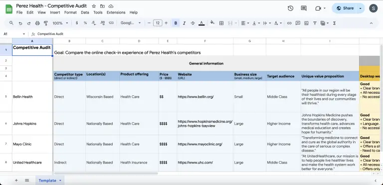
During the ideate phase of Perez Health, a competitive audit was conducted to evaluate the strengths and weaknesses of competitor apps. Notable findings included a competitor app requiring users to scroll to find the log-in, indicating a usability issue, and another app using highlighted text for navigation, which was seen as a positive example. These insights informed the design direction for the app, aiming to simplify the process and improve user experience.
Click the button below to view full image.
How Might We Statement
The how might we statement for the app was implemented by using it as a guiding question to brainstorm solutions and design ideas. The statement focused on. simplifying the check-in process and reducing unnecessary information that could clutter the app and frustrate the user. This question was used to ideate and prototype features that would address these challenges, such as clearer navigation, simplified forms, and more intuitive interactions. This approach helped to keep focus on the user's needs and ensure that the final design would effectively solve the identified problems.
How might we make the simplest and most efficient e-Check-In experience?
Rapid Sketches
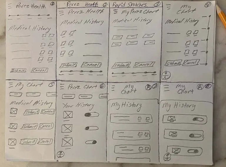
Creating rapid sketches for Perez Health involved quickly sketching out design ideas and concepts to explore different approaches to the check-in process. These sketches were used to visualize potential solutions and generate new ideas. Rapid sketches were helpful in exploring a wide range of possibilities and ultimately led to the development of more effective and user-friendly designs for the e-Check-In app.
What Was Learned
Low-Fidelity Prototype Phase
Flow Chart
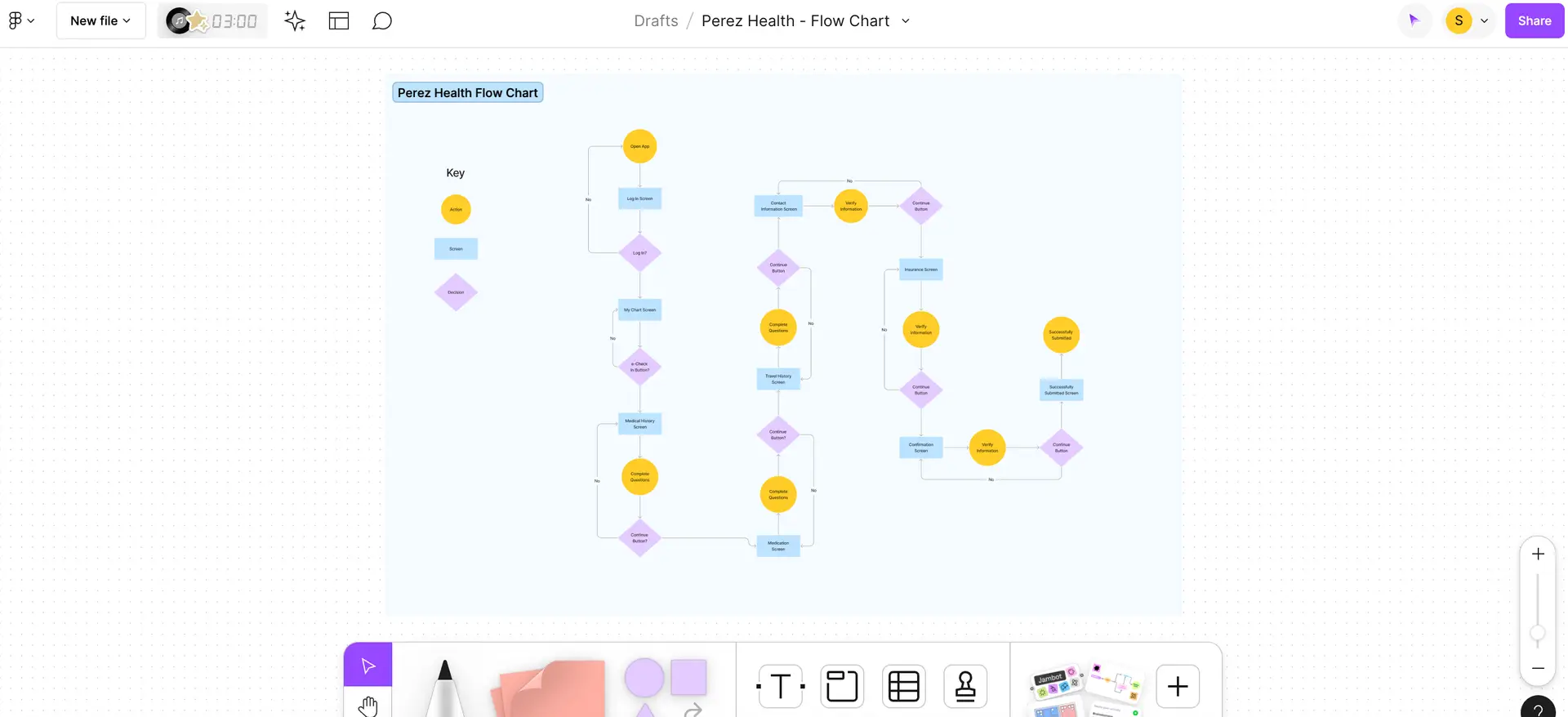
Building the flow chart for Perez Health involved mapping out the user journey through the e-Check-In app. The flow chart visualized the different screens and interactions users would encounter, from logging in to completing the check-in process. This helped identify potential bottlenecks or areas of confusion in the user experience and iterate on the app's design to improve usability.
Storyboards
Creating storyboards during the low-fidelity prototype phase involved illustrating the key steps and interactions in the user journey through the e-Check-In app. Storyboards helped visualize how the users would navigate through the app, highlighting pain points or areas where the user experience could be improved. By mapping out the user journey in this way, it made identifying and addressing potential issues early in the design process easier, leading to a more user-friendly and intuitive app.
Sitemap
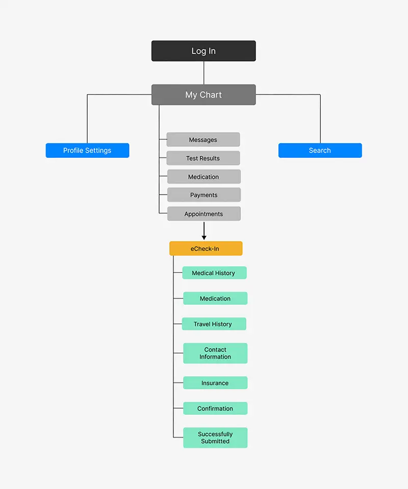
The implementation of the sitemap involved outlining the structure and hierarchy of the app's pages and content. The sitemap visually represented how different sections of the app were connected and organized, helping to ensure a logical and intuitive navigation flow. This sitemap served as a blueprint for the app's design, guiding the placement of content and features to enhance the overall user experience.
Paper Wireframes
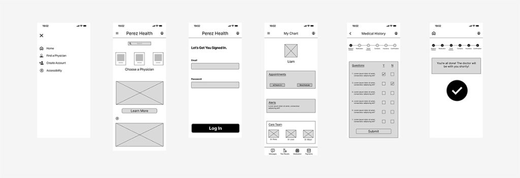
The paper wireframes involved sketching out the basic layout and structure of the app's screens on paper. These paper wireframes were used to visualize the placement of content and features, as well as the overall flow of the app. They allowed for quick iteration on different design ideas and gather feedback from stakeholders. Paper wireframes helped to flesh out the initial concepts for the app and served as a foundation for creating more detailed digital wireframes later in the design process.
Click on image to enlarge
Lo-Fi Digital Wireframes
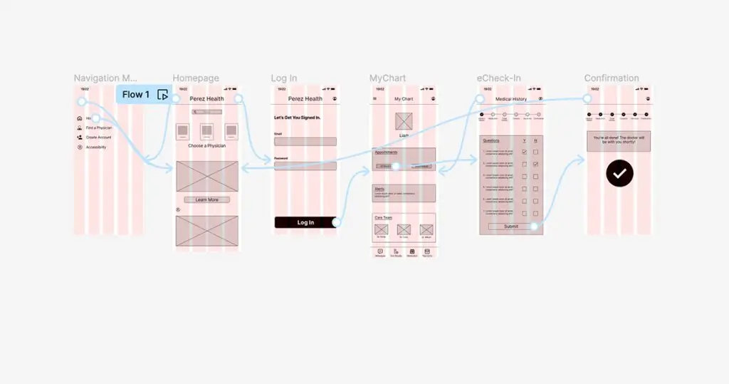
Lo-Fi digital wireframes were developed using Figma by translating the initial sketches and concepts into a digital format. These digital wireframes provided a more detailed and interactive representation of the app's interface, helping to refine the user experience before moving on to high-fidelity prototyping.
Lo-Fi Prototype
Figma was used to build interactive low-fidelity prototypes based on the digital wireframes. These prototypes simulated the user experience and allowed for testing different interactions and flows with the app. These low-fidelity prototypes served as a valuable tool for validating design decisions, and informing the development of the final product.
What Was Learned
During the low-fidelity prototype phase, key learnings were gathered through the creation of a flow chart, storyboards, a sitemap, paper wireframes, digital wireframes , and prototypes. These tools helped visualize the app's structure, navigation, functionality, and user interactions, identifying potential usability issues and areas for improvement.
Test Phase
Usability Study
In the test phase of the Perez Health app, the usability study revealed several key findings. One user suggested adding a lock icon when typing the password on the login screen for added security. Another user felt that checkboxes on the medical history screen should visually differentiate between checked and unchecked states for clarity. A third user was confused by the medication and transfer screens, as they were asked to list answers in an input field while also tapping an "add" button to answer questions simultaneously. Multiple users questioned the necessity of the navigation menu, suggesting that all navigation could be consolidated on the homepage.
The affinity mapping process helped synthesize these findings by organizing them into categories and identifying patterns. This process revealed common themes such as the need for clearer visual cues, simplification of interaction patterns, and streamlining of navigation. These insights were prioritized to improve the user experience of the app.
High-Fidelity Prototype Phase
Sticker Sheet
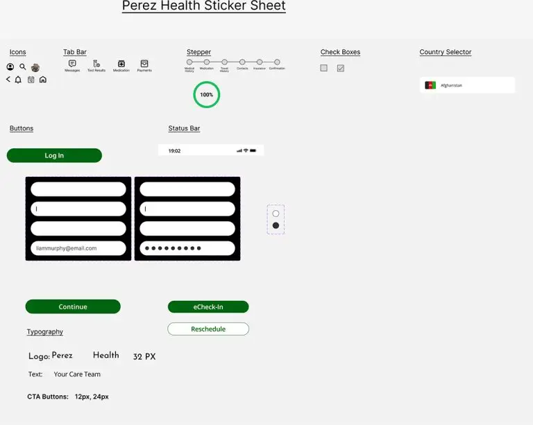
Developing a sticker sheet for the Perez Health app involved creating a set of reusable design elements and components that could be easily applied across different screens and interfaces. The sticker sheet included items such as buttons, icons, a tab bar, and typography, ensuring visual consistency throughout the app. This approach helped streamline the design process, making it easier to maintain a cohesive look and feel across the app's interface.
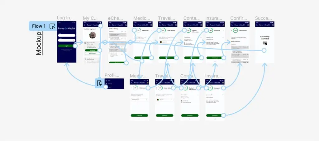
Mockups & Additional Screens
Developing mockups and additional screens for the Perez Health app involved creating visual representations of the app's interface and user interactions. These mockups provided a more detailed and realistic view of how the app would look and function, helping to refine the design before moving to the high-fidelity prototype phase. Additional screens were created to represent different scenarios or use cases, such as mobile and tablet versions of the app, ensuring that the design was responsive and optimized for various devices and screen sizes.
Click on image to enlarge
Hi-Fi Prototype
The creation of high-fidelity prototypes involved refining the design based on insights from the usability study. Changes were made to address specific user feedback, such as adding a lock icon for password input, visually distinguishing between checked and unchecked checkboxes, and simplifying the medication and transfer screens. These changes were implemented to improve the overall user experience and ensure that the app was more intuitive and user-friendly.
What Was Learned
During the high-fidelity prototype phase, several key learnings were gathered. The usability study provided valuable insights into user preferences and pain points, which informed changes to the high-fidelity prototypes. These changes, such as adding visual cues and simplifying interactions, were aimed at improving the user experience. Additionally, creating different versions of the app for mobile and tablet devices highlighted the importance of designing for different screen sizes and platforms. Overall, the high-fidelity prototype phase helped refine the app's design and functionality, ensuring a more user-friendly and intuitive experience.
Key Takeaways
The creation of the Perez Health e-Check-In app yielded several key takeaways and an impactful result. Through user research, ideation, prototyping, and testing, key UX issues were identified and addressed, such as information overload and complex check-in processes. By simplifying the interface, improving visual cues, and enhancing navigation, the app now offers users a more intuitive and efficient check-in experience. The addition of mobile and tablet versions further enhances accessibility. The app's transformation reflects a user-centric approach, resulting in a more user-friendly and effective tool for managing healthcare appointments.
Reflection
Ready to bring your ideas to life? I'm here to help
Similar projects
