Shane's Subs
Shane's Subs is a local sub sandwich shop in a suburban neighborhood. It offers healthy meal options at a competitive price to busy families, young adults, and professionals.
Project Overview
Shane’s Subs aims to create a seamless and enjoyable experience for customers ordering food through their app. This involves addressing user needs for convenience, menu variety, quick service, and accessibility to increase customer satisfaction and loyalty.
Empathize

User interviews were conducted to understand the needs and preferences of potential app users.
Define & Ideate

Insights from data collected led to the development of innovative ideas to address the UX problems.
Prototype & Test
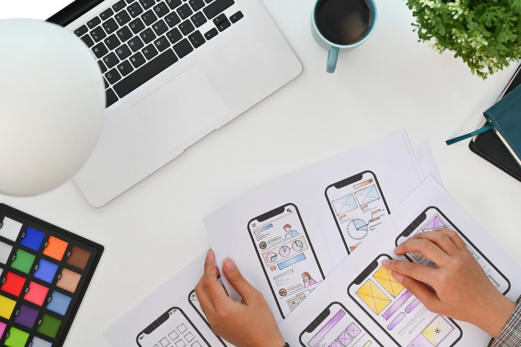
Low-fidelity prototypes were created to visualize the app’s interface and user flow. Usability testing was conducted to gather feedback from users and identify areas for improvement.
Empathize
User Interview
The interview process targeted busy suburban and urban adults, 18-55 years old who value convenience, menu variety, and quick service.
Research goals that were used to guide the interview process were:
What are the user’s pain points with online food ordering?
What are the user’s desire’s when it comes to a food app?
How do adults juggle planning for meals around their busy schedule?
Some of the interview question included:
How do you plan for meals around your busy schedule?
How often do you order food online?
What are some things that frustrate you about food-ordering apps?
What are some things you would like to see in a food-ordering app?

During the interviews, several user pain points were discovered. Users expressed frustration with the difficulty of finding and ordering their desired items quickly and efficiently. Additionally, users desired more personalized recommendations and a smoother checkout process. These pain points highlighted opportunities for improvement in the app’s design and functionality to enhance user experience.
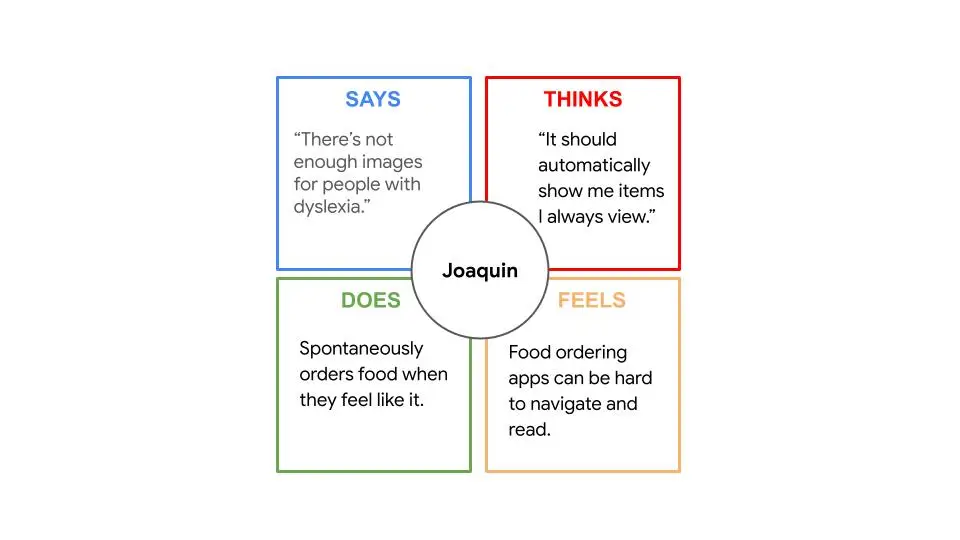
Empathy Maps
For Shane's Subs, four one-user empathy maps and two aggregated empathy maps were created, focusing on what users said, thought, did, and felt. These maps provided deep insights into user experiences, highlighting the need for a more intuitive and efficient food ordering app. They revealed that users sought easier navigation, faster order processes, and more personalized recommendations. These insights informed the design process, emphasizing the importance of tailoring the app to better meet user needs and preferences.
User Personas
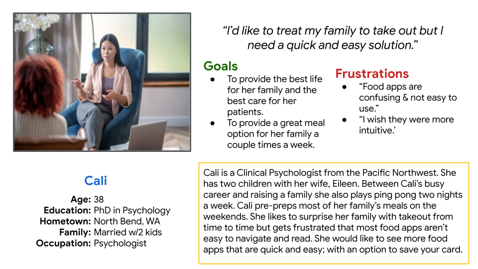
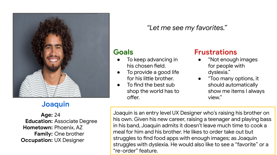
For Shane’s Subs, two user personas were created to represent different types of app users. These personas help to empathize with users who share similar characteristics and needs, guiding the design and development of the app to better meet their expectations.
User Stories
User stories were created to capture the tasks and activities that users like Cali and Joaquin might perform while using the app. Cali's user story as a busy professional and parent includes a desire for more intuitive food apps with an option to save payment methods, allowing her to quickly return to her patients and family. Joaquin's user story as a young adult with dyslexia involves a wish for more food apps with images, a favorites menu, or a re-order feature to avoid feeling overwhelmed by reading descriptions. These user stories help to prioritize features and design elements that will improve the overall user experience for Shane's Subs app users.
User Story Cali: “As a busy professional and parent I want to see more intuitive food apps with an option to save your payment method, so that I’m able to get back to my patients and family quicker.”
User Story Joaquin: “As a young adult with dyslexia I want to to see more food apps with images, a “favorites” & “re-order” feature, so that I don’t get so overwhelmed trying to read all the descriptions.”
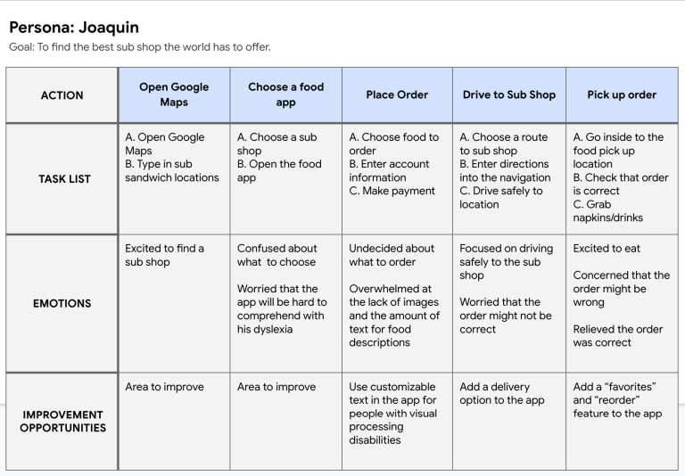
User Journey Map
The user journey map for Shane's Subs follows a user named Joaquin, as he discovers, downloads, and uses the app. The journey begins with Joaquin searching for a sub shop on Google Maps, leading him to discover Shane's Subs. He then downloads the app to explore the menu and place an order. Joaquin feels excited to try out the app but also slightly apprehensive about how easy it will be to use. As he navigates the app, Joaquin encounters challenges in choosing a meal due to the lack of images and customizable text options, which is frustrating for him as he has dyslexia. He also long for a favorites and re-order feature, which would make it easier for him to select items he enjoys. After selecting his meal, Joaquin enters his payment information and schedules a pick-up time. Overall, the user journey map highlights opportunities for improvement in the app, such as implementing customizable text options for people with disabilities, as well as implementing a favorites and re-order features to enhance the user experience.
What Was Learned
During the Empathize Phase of Shane's Subs, several key insights were learned through user interviews, persona creation, user stories, and user journey mapping. From user interviews, it was discovered that users value convenience, menu variety, and quick service when using a restaurant app. This insight was further emphasized through the creation of user personas, which helped empathize with different user demographics and their specific needs. User stories provided a detailed understanding of the tasks and activities users perform while using the app, highlighting pain points and areas for improvement. Additionally, the user journey map visualized the user's experience from discovering the app to completing an order, uncovering emotions and challenges users face throughout the process. Overall, the Empathize Phase provided valuable insights into user needs and preferences, which served as the foundation for guiding the design and development of Shane's Subs app to better meet user expectations.
Define & Ideate
Problem Statement
The problem statement created for Shane's Subs addresses the need for a more intuitive food-ordering app, particularly for users like Joaquin.
Joaquin is a busy young adult who needs a food-ordering app that’s less descriptive and more intuitive because he struggles with dyslexia.
This problem statement highlights the importance of improving the app’s accessibility and usability for users with disabilities, such as dyslexia, to ensure a more inclusive and user-friendly experience for all customers.
Goal Statement
The goal statement for Shane's Subs is to create a sandwich app that allows users to easily order their favorite meals.
Our sandwich app will let user easily order their favorite meals which will affect busy adults by allowing them to customize their app experience through personal accessibility features.
By offering personalized accessibility features, the app will be more inclusive, ensuring that all customers can enjoy a seamless ordering experience.
Competitive Audit
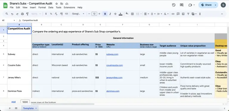
The competitive audit for Shane's Subs provided valuable insights into the features and usability of competitor apps, such as Subway, Cousins, and Jersey Mike's. The audit revealed that while some competitors offered very limited accessibility features, others, like Jersey Mike's, provided a full accessibility menu, catering to users with disabilities. Additionally, the audit highlighted varying levels of ease in app navigation, with some competitors offering easy navigation and others having poor navigation that made it difficult for users to find their way around the app. These findings underscore the importance of implementing comprehensive accessibility features and ensuring intuitive navigation in Shane's Subs app to provide a competitive and user-friendly experience.
Click the button below to view full image.
What Was Learned
During the define phase of Shane's Subs, the insights gathered from the empathize phase were synthesized to create a problem statement, and a goal statement. The problem statement identified the need for a more intuitive food ordering app, especially for users like Joaquin who struggle with dyslexia. The goal statement aimed to create an app that allows users to easily order their favorite meals, with a focus on customization and personal accessibility features. These statements provided a clear direction for the design and development of Shane's Subs app, ensuring that user needs and preferences were addressed effectively.
In the Ideate phase, ideas were generated to address the identified UX problem and achieve the defined goals. Insights from the competitive audit revealed varying levels of accessibility features and navigation ease in competitor apps, emphasizing the need for comprehensive accessibility features and intuitive navigation in Shane's Subs app. Brainstorming sessions resulted in a variety of creative solutions, such as implementing customizable text options for users with disabilities and expanding the favorites and re-order features to enhance the user experience. Overall, these phases informed the design and development of Shane's Subs app to better meet user needs and expectations.
Low-Fidelity Prototype Phase
Flow Chart
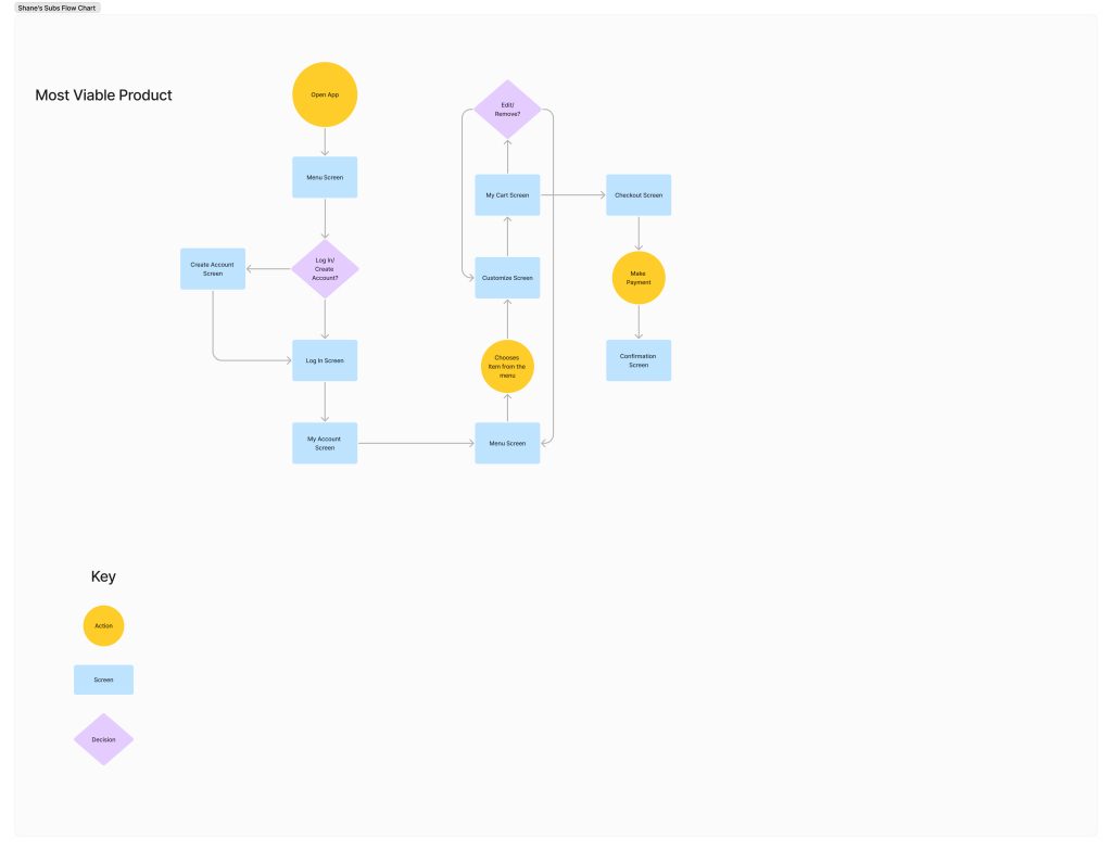
The flow chart developed for Shane's Subs visualizes the user journey from opening the app to completing an order. It outlines the steps a user takes, starting with opening the app and registering an account, then browsing the menu, customizing their order, entering payment information, and finally, confirming the order. The flow chart provides a comprehensive overview of the app's functionality and helps identify areas for improvement in the user experience.
Storyboards
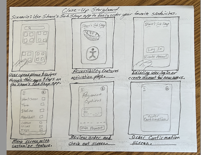
The storyboards created for Shane's Subs depicted the user experience in a visual narrative format, highlighting key interactions and emotions throughout the ordering process. The storyboards shows a user discovering the app and feeling excited to try it out, while another illustrates the user's apprehension in trying a new food app not knowing if they'll encounter difficulties orders due to the lack of accessibility. These storyboards helped to identify pain points and opportunities for improvement in the app's design and functionality, informing the iterative design process to create a more seamless and enjoyable user experience.
Sitemap
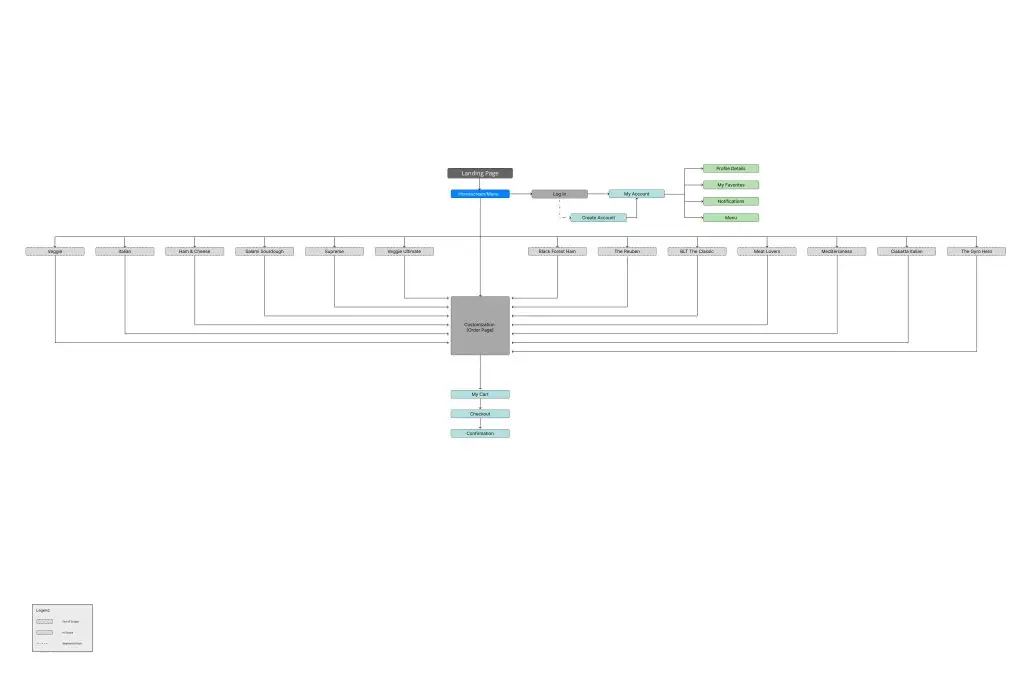
The sitemap created for Shane's Subs provided a structural overview of the app's pages and navigation paths. It outlined the main sections of the app, such as the menu, customization screen, checkout screen, and order confirmation. The sitemap also showed how users would navigate between these sections, highlighting the flow of the app and ensuring that all important pages were included. This sitemap helped to organize the app's content and navigation in a logical manner, improving the overall user experience.
Paper Wireframes
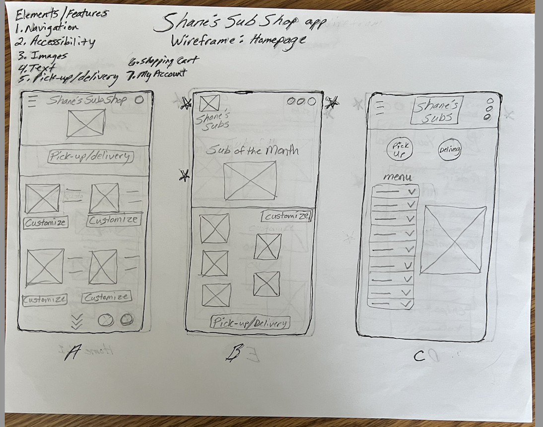
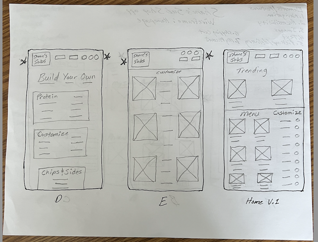
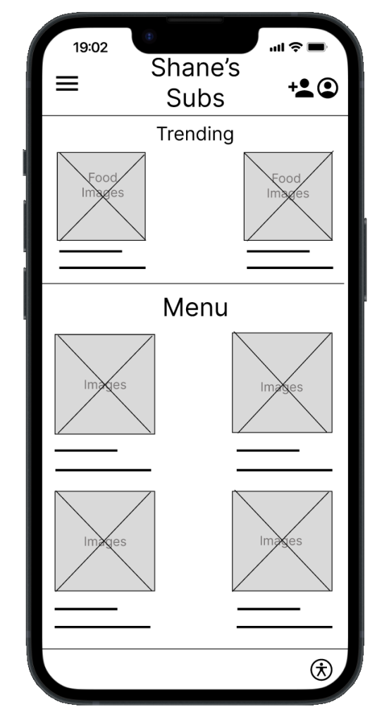
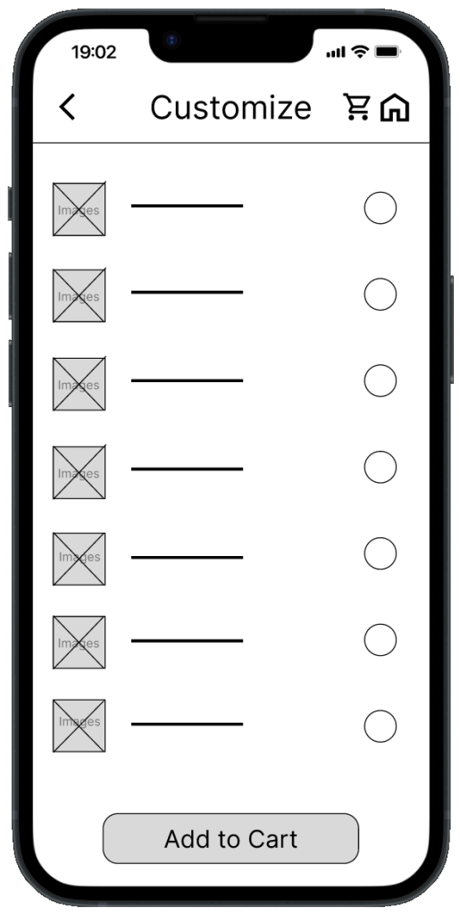
The paper wireframes created for Shane's Subs included sketches of key screens such as the home, my account, customize, checkout, and confirmation screens. The home screen featured a clear layout with prominent menu options and a navigation menu. The my account screen allowed users to manage their profile and view rewards. The customize screen showed options for customizing menu items, such as choosing toppings or sides. The checkout screen included fields for editing or removing items, and entering payment information. Finally, the confirmation screen provided a summary of the order and a confirmation message. These paper wireframes helped to visualize the app's layout and functionality, informing the design of the digital wireframes and prototypes.
Lo-Fi Digital Wireframes
The low-fidelity digital wireframes for Shane's Subs translated the paper sketches into digital format, providing a more detailed and interactive representation of the app's screens. These wireframes maintained a basic design aesthetic with minimal visual elements, focusing on the layout and functionality of key screens such as the home, my account, customize, checkout, and confirmation screens. The digital format allowed for iteration on the design and make improvements based on feedback. Overall, these low-fidelity digital wireframes served as a foundation for the development of high-fidelity prototypes.
Menu and Customization Screen
Lo-Fi Prototype
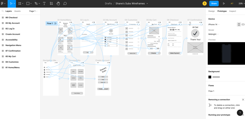
The low-fidelity prototypes created with Figma for Shane's Subs were interactive representations of the app's design, allowing for user testing and feedback. These prototypes maintained a simple and basic design, focusing on functionality rather than visual aesthetics. Users could navigate through key screens such as the home, accessibility menu, login, my account, customize, my cart, checkout, and confirmation screens, simulating the experience of using the app. The prototypes helped to validate the app's design and identify areas for improvement, guiding the design of the high-fidelity prototypes.
What Was Learned
During the creation of the low-fidelity prototype phase of Shane's Subs, several key learnings were derived from the design process. Firstly, the process highlighted the importance of simplicity and clarity in the app's design, particularly for users like Joaquin who struggle with dyslexia. This emphasized the need for the accessibility menu, as well as the use of images to aid understanding. Additionally, the prototypes revealed the significance of intuitive navigation and user-friendly features, such as the favorites option. The low-fidelity prototype phase provided valuable insights into the app's usability and functionality, informing the development of the high-fidelity prototypes.
Test Phase
Usability Study
The usability study for Shane's Subs provided valuable insights into the user experience and identified areas for improvement in the app's design. One user expressed frustration over the limited menu options, highlighting the importance of offering a wide variety of choices to cater to different preferences. Another user disliked being forced to go to the customization screen, suggesting the need for an option to skip customization for those who prefer a simpler ordering process. Other users showed frustration in what the accessibility icon was, indicating text underneath the icon might be needed. However, the majority of users found the ordering process easy, indicating that the app's design was generally user-friendly. These findings underscore the importance of offering flexibility in the app's features to accommodate different user preferences and streamline the ordering process.
Affinity Diagram
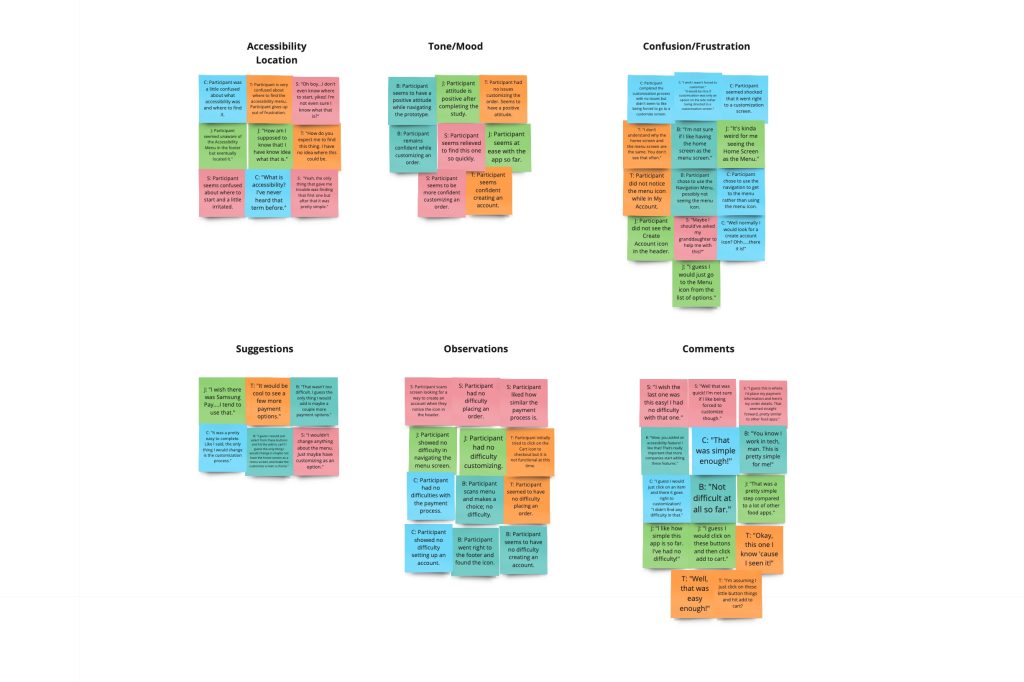
The affinity diagram created with Miro for Shane's Subs helped to organize and prioritize the findings from the usability study and user feedback. The diagram grouped similar insights and comments into categories, such as menu options, accessibility menu icon, customization process, and overall user experience. This visual representation allowed for identifying common themes and patterns, such as the need for more menu options and flexibility in the customization process. These insights were then prioritized based on their impact on the user experience, guiding decisions to improve the app's design and functionality. The affinity diagram served as a valuable tool for synthesizing and analyzing user feedback, ensuring that the app met user needs and expectations.
Patterns/Insights/Prioritize
During the analysis of user feedback for Shane's Subs, several patterns and insights were identified, guiding the prioritization of improvements to the app. Firstly, the data showed that 3 out of 5 users expressed a desire for more payment options. This highlighted the need to expand the app's payment methods to cater to a wider range of user preferences. Additionally, 3 out of 5 users indicated that they would like customizing their order to be an option rather than a requirement. This suggested that offering customization as an opt-in feature would improve the user experience for those who prefer a simpler ordering process. Furthermore, 4 out of 5 users reported confusion about the accessibility icon, indicating a need for clearer information to accommodate users with disabilities. These insights were prioritized based on their impact on the user experience, with a focus on addressing the most pressing issues first to improve overall usability and satisfaction.
What Was Learned
During the test phase of Shane's Subs, several key learnings were derived from user testing and feedback. The usability study revealed that while the majority of users found the ordering process easy, there were still areas for improvement. For example, some users expressed frustration over the limited menu options and the requirement to customize their order, suggesting the need for more menu choices and the option to skip customization. Additionally, users reported confusion about accessibility features, highlighting the importance of providing clear information. Overall, the test phase provided valuable insights into the app's usability and functionality, informing the development of the high-fidelity prototypes and guiding improvements to enhance the user experience.
High-Fidelity Prototype Phase
Sticker Sheet
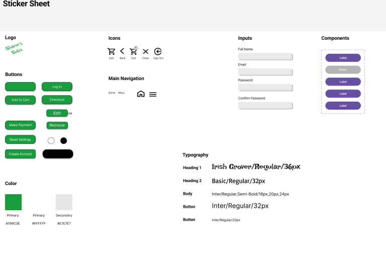
The sticker sheet developed for Shane's Subs included various components to ensure a cohesive and consistent design across the app. The sticker sheet also included the app's logo, ensuring that it was used correctly and consistently across all screens. Additionally, typography styles were included to define the app's text styles, ensuring a unified look and feel. Overall, the sticker sheet helped to enhance the design process and maintain a consistent visual identity for Shane's Subs app.
Mockups
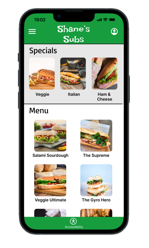
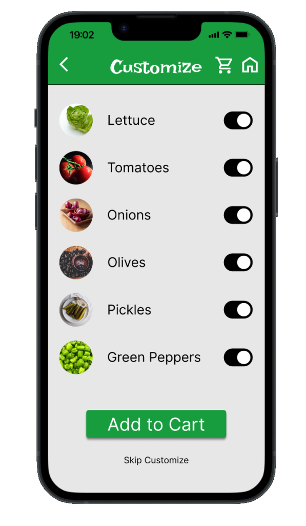
The mockups developed for Shane's Subs using Figma showcased several improvements based on user feedback and design considerations. Text was added below the accessibility icon to indicate its purpose, improving clarity for users. Additional menu items were added to the menu, offering users more choices and variety. Skipping customizing an order is now an option, providing a simpler ordering process for those who prefer it. Furthermore, more payment options were made available on the checkout screen, catering to a wider range of user preferences. These mockups demonstrated an iterative approach to design, incorporating user feedback to enhance the app's usability.
Menu and Customization Screen
Hi-Fi Prototype
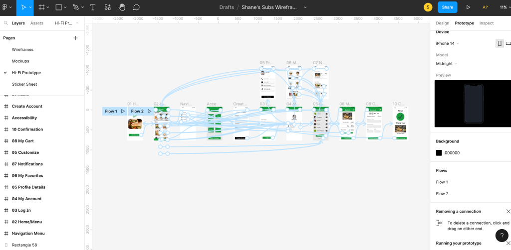
The high-fidelity prototypes developed for Shane's Subs represented a polished and detailed version of the app, incorporating all the improvements and features identified through the design process. These prototypes featured a refined visual design with high-quality graphics, typography, and layout. They included interactive elements, menus, and forms, allowing users to navigate through the app as they would with the final product. The prototypes also showcased the additional menu items, the option to skip customizing an order, and the availability of more payment options on the checkout screen, demonstrating how these features would be implemented in the app. The high-fidelity prototypes provided a realistic preview of the app's user interface and functionality, helping to validate design decisions and prepare for the app's development.
What Was Learned
During the high-fidelity prototype phase of Shane's Subs, several key learnings were derived from user testing and feedback. The prototypes revealed that the addition of text below the accessibility icon improved users' understanding of its purpose, enhancing the app's accessibility. The inclusion of additional menu items provided users with more choices and variety, leading to a more satisfying ordering experience. The option to skip customizing an order was well-received, simplifying the process for users who prefer a quicker ordering process. Furthermore, the availability of more payment options on the checkout screen catered to a wider range of user preferences, improving overall usability and convenience. These learnings were valuable in refining the app's design and functionality to better meet user needs and expectations.
Key Takeaways
The key takeaways of developing Shane's Subs include the importance of a user-centered design approach, iterative prototyping, and incorporating user feedback throughout the design process. By empathizing with users, defining clear problem statements, and ideating creative solutions, the app was refined to meet user needs effectively. The usability testing and feedback loops during the prototype phases helped identify areas for improvement and validate design decisions. Additionally, prioritizing accessibility features, such as clearer icons and text, and offering more customization options and payment methods, enhanced the app's usability and inclusivity. The development of Shane's Subs highlights the value of continuous iteration, collaboration, and a focus on enhancing the user experience to create successful digital products.
Reflection
Creating Shane's Subs was a valuable learning experience that emphasized the importance of user research, and iteration in UX design. Through user interviews, personas, and journey mapping, I gained insights into user needs and preferences, informing the design process. The iterative nature of prototyping and testing helped identify and address usability issues, leading to a more intuitive and user-friendly app. Additionally, focusing on accessibility features and customization options highlighted the importance of inclusivity in the app design. Overall, creating Shane's Subs reinforced the significance of empathy, creativity, and continuous improvement in creating successful digital products that effectively meet user needs.
Ready to bring your ideas to life? I'm here to help
Additional Work
